Widget Builder Guide
This guide is for client administrators configuring widgets in the BX Platform. If your looking at how to add a configured PG Amplify widget on your site you should skip to Installation & Setup.
Navigate to Amplify
- Log into the BX Platform
- Go to Brand Experience → Transparency
- Click Amplify
Creating a New Widget
Click Create Widget to open the Widget Builder. You'll configure your widget in three steps: Configure, Style, and Publish.
Step 1: Configure Your Widget
Name Your Widget
Enter a clear, recognizable name (e.g., "Cardiology Reviews Widget").
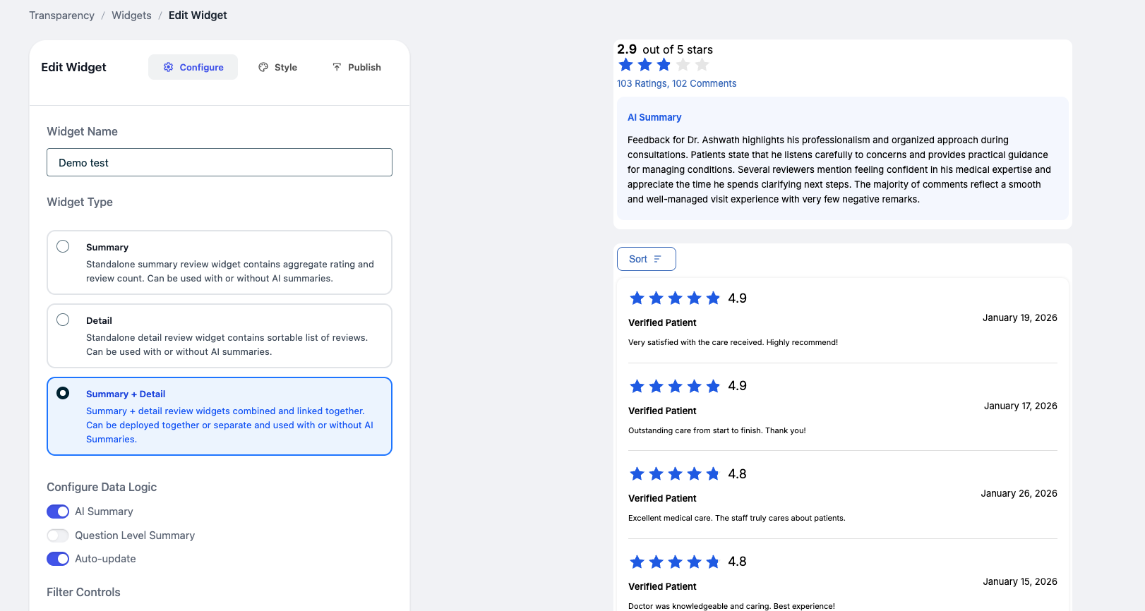
Choose a Widget Type
| Type | Description |
|---|---|
| Summary | Displays overall rating and review count. Best for a quick snapshot. |
| Detail | Shows individual reviews in a list with sorting and pagination. |
| Summary + Detail (Recommended) | Combines both views. Can be deployed together on one page or separated but linked across pages. |
Configure Data Options
Toggle these features on or off:
| Option | Description |
|---|---|
| AI Summary | Displays an automatically generated summary of reviews. |
| Question-Level Summary | Summarizes ratings for specific survey questions. |
| Auto-update | Keeps your widget updated with the latest data. On by default — only disable if you want to display static ratings that do not automatically update. |
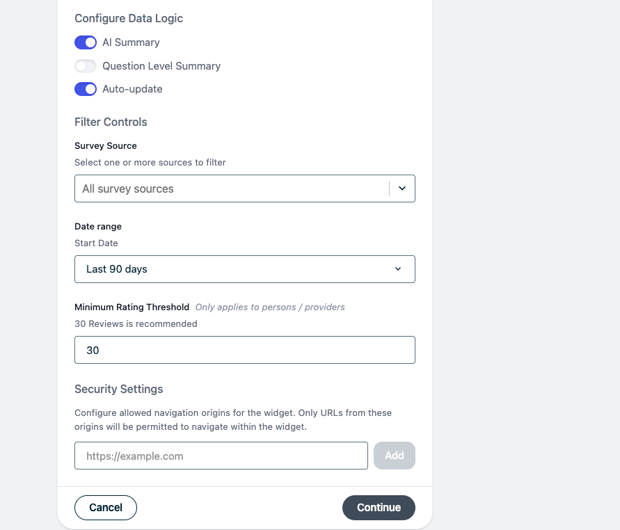
Apply Filters
Control what data appears in the widget:
| Filter | Description |
|---|---|
| Survey Source | Choose one or more data sources. |
| Date Range | Time window for included reviews (e.g., last 365 days is the most common setting). |
| Minimum Rating Threshold | Only display data after a minimum number of reviews. Recommended: 30. |
Security Settings (Optional)
Restrict where your widget can appear by adding approved website domains (e.g., https://yourwebsite.com).
Click Continue to move to styling.
Step 2: Customize the Design
Make the widget match your website's look and feel.
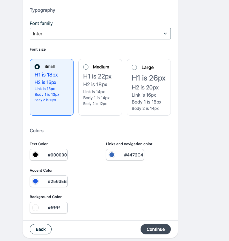
Typography
- Font family — Select from the dropdown. If your preferred font isn't listed (e.g., custom Adobe fonts), contact your CX Advisor or support rep. Provide the font file and it will be uploaded to your instance.
- Font size — Small, Medium, or Large.
Colors
| Setting | Description |
|---|---|
| Text color | Primary text color for the widget. |
| Link/navigation color | Color for clickable links and navigation elements. |
| Accent color | Color for star ratings, buttons, and highlights. |
| Background color | Widget background color. |
Live Preview
As you make changes, a preview updates in real time so you can see exactly how your widget will look.
Click Continue when finished.
Step 3: Publish Your Widget
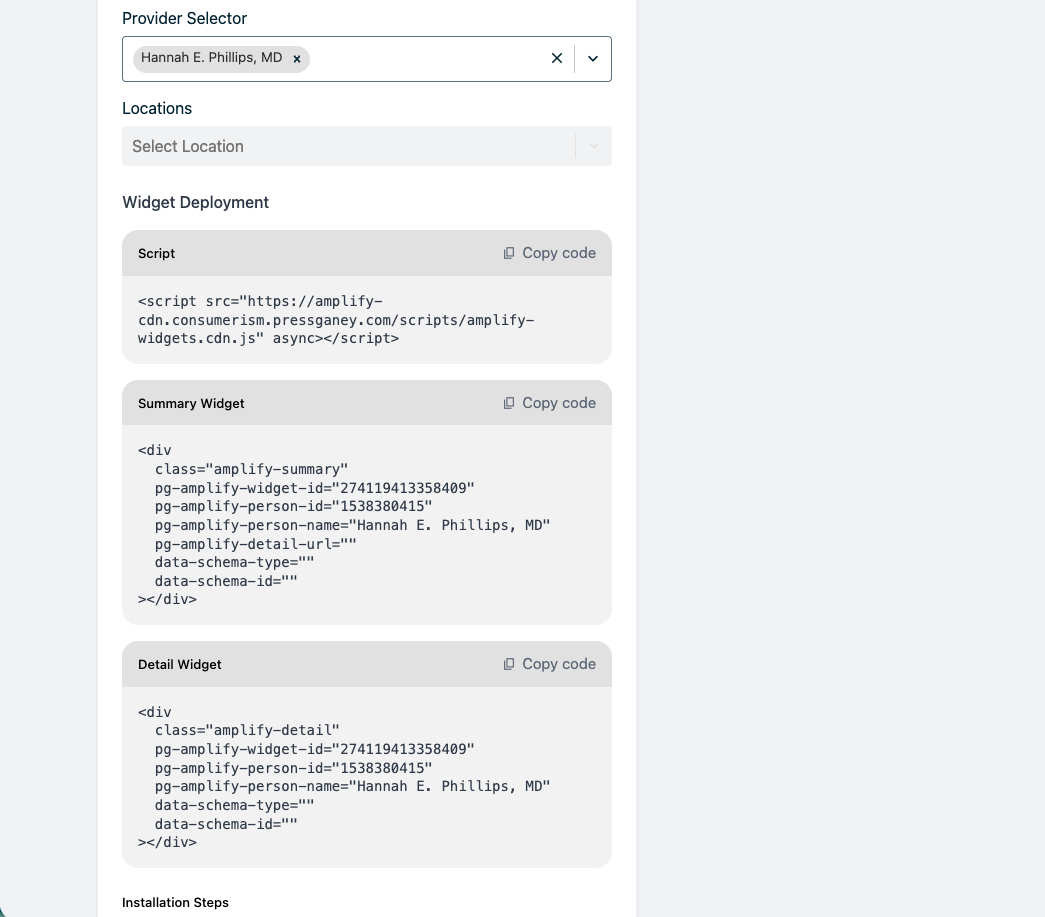
Select Content Source
Choose a Provider (e.g., doctor, staff member) and optionally a Location. This determines which reviews appear. If no provider or location is selected, sample data is shown in the preview.
Preview Your Widget
Review how the widget will appear with real data from the selected provider/location.
Copy Your Embed Code
Copy the generated HTML snippet and add it to your website. See Installation & Setup for detailed embedding instructions.
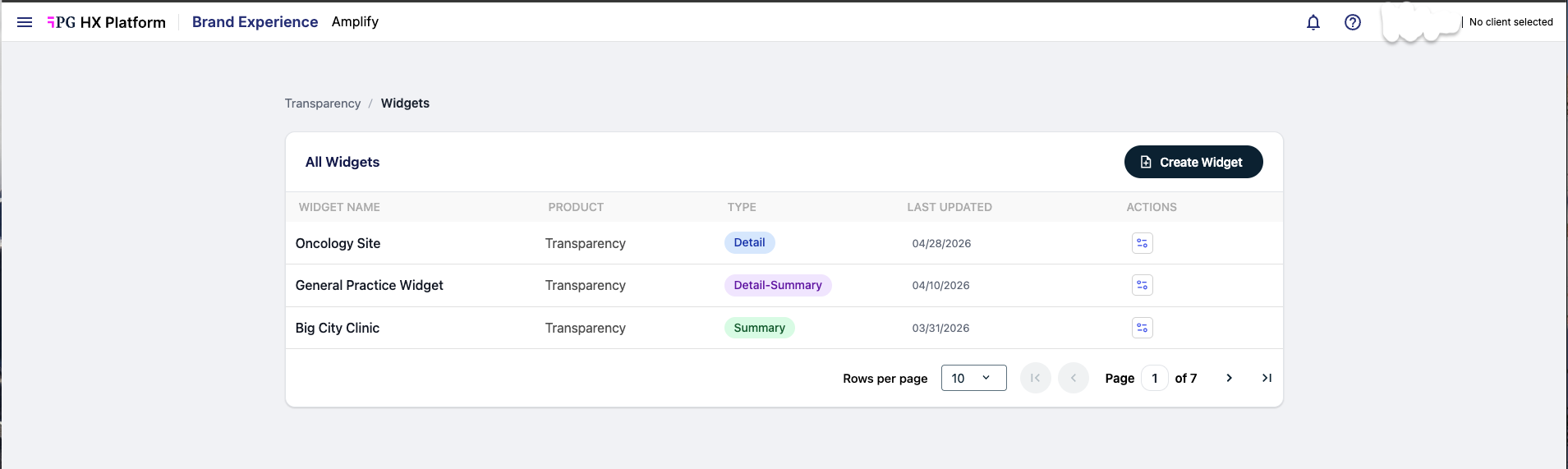
Editing an Existing Widget
- Go to Widgets
- Find your widget in the list
- Click the Actions menu
- Select Edit
You can update:
- Configuration — data options, filters, security settings
- Styling — typography, colors
- Provider/location selection
Changes will update wherever the widget is embedded.
Tips & Best Practices
- Use Summary + Detail for the best user experience
- Enable AI Summary for quick insights
- Set a minimum review threshold to ensure credibility
- Match colors to your brand for a seamless look
- Preview before publishing
Once your widget is configured, see Installation & Setup for instructions on adding it to your website.