Configuration Overrides
While your widget's styles and features are primarily managed through the Widget Builder in the Amplify admin UI, you can override specific properties locally on your webpage using the data-config-override attribute.
This is useful when a specific widget instance needs a different color, font size, or feature toggle — for example, turning off the AI summary for a particular provider or matching a landing page's unique color scheme.
How It Works
The data-config-override attribute accepts a valid JSON string that merges over your default CDN configuration.
What You Can Override
| Category | Properties | Example |
|---|---|---|
| styles | accentColor, textColor, fontFamily, font-size, and most other visual properties | "styles": {"accentColor": "#FF0000"} |
| options | Feature toggles: showAISummary, showQuestionSummary, aiSummaryOnly, verifiedReviewLabel | "options": {"showAISummary": false} |
What You Cannot Override
| Category | Reason |
|---|---|
| filters | Data filters are managed exclusively in the admin UI to ensure data integrity. |
| widgetType | Use the standard class attribute (amplify-summary, amplify-detail) to control widget type. |
Combined Example
<div
  class="amplify-summary"
  pg-amplify-widget-id="my-clinic-widget-123"
  pg-amplify-person-id="dr-john-smith"
  data-config-override='{"styles": {"accentColor": "#FF0000"}, "options": {"showAISummary": false}}'
></div>
This renders a summary widget with a red accent color and the AI summary hidden, regardless of the default configuration set in the admin UI.
Summary Display Options
All three summary options affect what content appears inside the summary widget, but they operate at different levels. Understanding the distinction helps avoid unexpected results.
| Option | What it controls | Overrides admin UI? |
|---|---|---|
showAISummary | Toggles the AI-generated summary section on or off | No — follows the admin setting unless explicitly overridden here |
showQuestionSummary | Toggles the per-question patient review ratings section on or off | No — follows the admin setting unless explicitly overridden here |
aiSummaryOnly | Switches the widget into a mode that shows only the AI summary, hiding all other content | Yes — forces the AI summary on regardless of the admin setting |
The first two options are additive toggles: they layer content on top of the base widget (score, stars, ratings/comments count). aiSummaryOnly is a mode switch: it replaces all of that base content with just the AI summary.
showAISummary
Shows or hides the AI-generated summary block within the widget. This respects whatever is configured in the Amplify admin UI unless explicitly set here.
data-config-override='{"options": {"showAISummary": false}}'
Use this when you want to suppress the AI summary for a specific provider or page without touching the admin configuration.
showQuestionSummary
Shows or hides the per-question patient review ratings breakdown within the widget.
data-config-override='{"options": {"showQuestionSummary": false}}'
aiSummaryOnly
Switches the widget into a mode where only the AI summary is rendered. The overall satisfaction score, star rating, and ratings/comments count are all hidden.
Setting aiSummaryOnly: true overrides the AI Summary toggle in the Amplify admin UI. The AI summary will be shown regardless of whether it was enabled in the admin — and all other widget content will be hidden. This applies to both the standalone summary widget and the summary + detail combination widget.
This is the key difference from showAISummary: true, which only shows the AI summary section if it is already enabled in the admin.
data-config-override='{"options": {"aiSummaryOnly": true}}'
Use this when you want a specific page or provider profile to present only the AI-generated narrative, without any accompanying numeric ratings.
Detail Widget Options
verifiedReviewLabel
Controls how the "Verified Patient" label is displayed within the detail widget's comment list. This label appears on each comment to indicate the review came from a verified patient.
There are three modes:
| Value | Behavior |
|---|---|
"default-inline" | Shows a "Verified Patient" text label inline on each comment row (default) |
"hide-label" | Removes the "Verified Patient" label entirely — only the date remains on the comment row |
"table-disclaimer" | Removes per-comment labels and instead shows a single "Verified Patient Reviews" disclaimer header above the comments table |
"default-inline" (default)
Each comment row displays a "Verified Patient" text label next to the verified checkmark. This is the default behavior when no override is set.
data-config-override='{"options": {"verifiedReviewLabel": "default-inline"}}'
"hide-label"
Removes the "Verified Patient" label from each comment row entirely, leaving only the date. Use this for a more compact layout or when the verified context is communicated elsewhere on the page.
data-config-override='{"options": {"verifiedReviewLabel": "hide-label"}}'
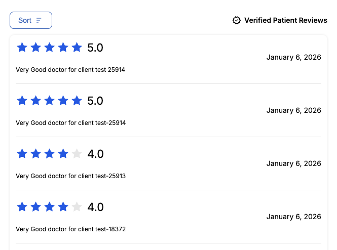
"table-disclaimer"
Per-comment labels are removed. Instead, a single disclaimer header reading "Verified Patient Reviews" (with a checkmark icon) appears above the comments table. This mode automatically loads the Material Symbols Outlined font.
data-config-override='{"options": {"verifiedReviewLabel": "table-disclaimer"}}'